ShopDreamUp AI ArtDreamUp
Deviation Actions


Suggested Deviants


Suggested Collections


You Might Like…


Featured in Groups


Description
:origin()/pre05/19b5/th/pre/f/2016/345/1/f/conflicts___page_3_by_0laffson-dar97oa.png) Previous page | Next page
Previous page | Next page
:origin()/pre00/196d/th/pre/f/2017/075/b/d/conflicts___page_5_by_0laffson-db2jcva.png)
First Page
______________________________________________
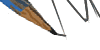
Whoops, sorry everyone!
Poor Gunther really can't catch a break, that pike is getting closer and closer! XD Let's hope his "last hope" will work!
As always, critiques and suggestions to help me improve are more than welcome! ^^
Image size
1100x1574px 3.47 MB
© 2016 - 2024 0laffson
Comments44
Join the community to add your comment. Already a deviant? Log In
A pretty well done piece overall. I like the shininess of the metal armor, the shading and coloring in general really, and as far as the human figure goes I don't see any problems.
Expressions: overall you did pretty good here. The grey haired man in the first two panels has a very expressive face, and I like the black haired man's face in the top left and bottom right panels. The middle panel probably has the weakest faces; the blonde haired man's is fine and the soldiers' faces don't really need to be anything special (unless they are recurring characters), but the black haired man's face leaves something to be desired, especially considering his emotion in the very next panel. It seems like he goes straight from an almost sleepy exasperation to fist-pounding anger. I get that he's essentially remaining composed until he leaves the official's presence but I think the transition is still a little jarring.
Action: I absolutely love the top right panel, I think it may be the best on the page in terms of expressiveness. We can see the formal bow play out and the disdainful and dismissive reception by the grey haired man. That said, the bottom left panel is one of the weakest ones on the page. I feel like the stance of the black haired man, his expression, and the fist pounding are all just a shade too wishy-washy. I would suggest making his expression and pose more dramatic. I'd maybe hunch him forward a little and make his right arm go off at an angle instead of just straight out. As it stands, it appears he calmly walked over to the wall, raised his fist up, and gave it a little tap, whereas I feel like what you were going for with this panel was a momentary loss of composure; a view into the character's frustration. It feels too blunted to me.
I'll say that it's a little tough for me to rate "vision," "originality," and "impact" on this piece since I haven't read the rest of the comic, so take those ratings with a grain of salt.